
No. 004On the drawing board
The part you can’t see in a photograph.
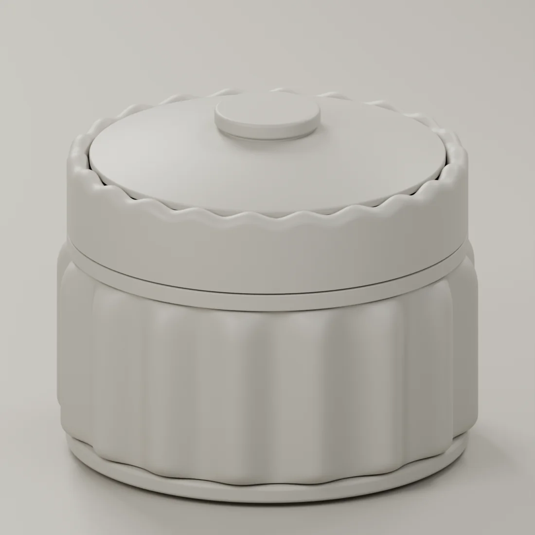 Form
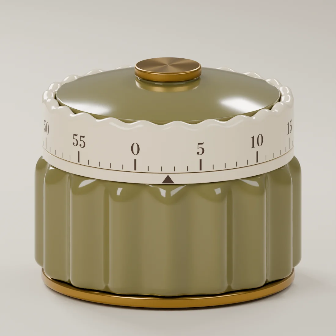 Color
A photograph can tell you quite a lot about a kitchen timer. You can see its shape, the color of the body, the numbers around the dial. You can imagine where it might sit in your kitchen.
A little timer. A lot of thought.
The questions we’re working through now begin when you imagine reaching for it.
How should the dial feel as you turn it? Can you read the markings from where you’re standing? Will the body stay steady on the counter? What should the alarm sound like in a room where dinner is happening?
Those details are all part of the design.
For the Scallop Timer, we’ve established an exterior direction: a scalloped body, a cream dial and brass-tone accents. Digital studies let us look closely at the relationships between those pieces. We can change the proportions, compare views and see how the whole object comes together.
Now the exterior and the working mechanism need to come together as a physical object. The movement needs space inside the body. The dial needs to connect to it properly. The pieces need to stay together through use. Each decision has consequences for the next.
This is where a familiar object becomes an interesting design problem. A timer is small enough to seem straightforward, yet the experience of using it depends on many things agreeing with one another.
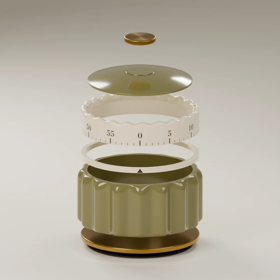
Our aim is a simple moment: reach over, set the time and return to what you’re making. We have to work through the details that make that moment possible.
The physical finishes and working mechanism are still being developed. Samples and testing will need to answer questions that the digital studies leave open, including the winding feel, stability, timing performance and sound.
We want this journal to make that work visible as it develops. The finished photograph will be one part of the story. The experience someone has with the timer on an ordinary evening is what we’re designing toward.
Explore the form and color studies in Behind the Design.