
No. 001On the drawing board
A timer worth leaving out.
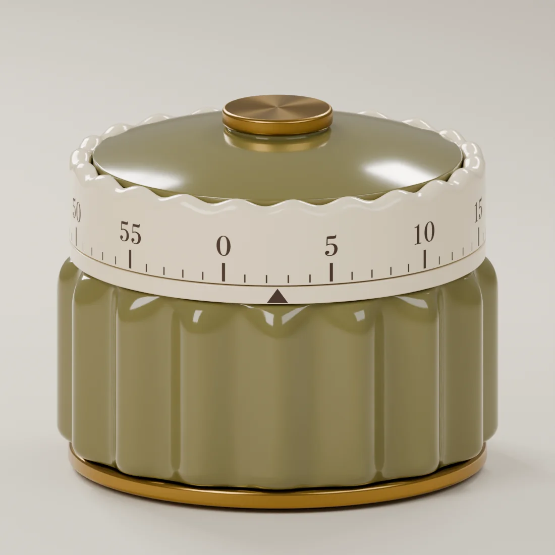
A kitchen timer spends most of its life waiting. Between the next tray of cookies and the next pot on the stove, it becomes part of the room. That is where the Scallop Timer began: with the thought that a useful object should also be a pleasure to live with.
A little timer. A lot of thought.
Start with the shape.
Our starting point was a compact, scalloped form, with a cream dial and a small brass-tone accent. Those are the details that give the design its character. The body has broad curves; the edge around the dial repeats them on a smaller scale. There is a little rhythm between the two.
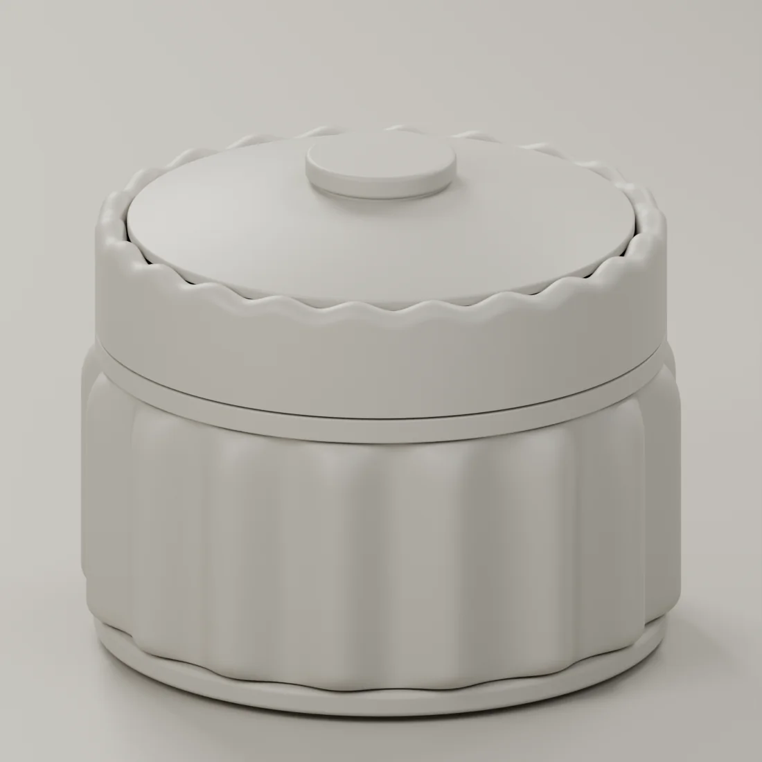
The neutral form study is useful here. Without a color to fall for, the outline has to do the work. We can look at the shoulders, the rim and the balance of the pieces together. A shape that seems gentle in one view can feel quite different from another.
In the digital refinements, we softened the shoulders and lowered the wave around the dial. These are small changes, but they affect the whole silhouette. The aim is a familiar feeling without borrowing a history the product does not have.
Let color change the feeling.
Olive, Buttercream, Cranberry, Dusty Rose, Cinnamon and Espresso all share the same shape. Together they make a palette that can feel sunny, earthy, rich or quiet. There is no need for every kitchen to choose the same version.
The cream dial gives the colors a common starting point. Brass-tone details add a small amount of contrast. In the digital studies, we can put those relationships next to one another and ask whether each color still belongs to the same family.
A color on a screen is a direction, not a physical finish. Samples will need to show how it behaves in daylight, beside the dial and across the curves of the body. That part of the work is still ahead, and we want to keep the difference clear.
Make room for the everyday.
We think about the timer beside objects that are already there: a mixing bowl, a recipe notebook, the mug that rarely makes it back into the cupboard. A useful kitchen object should be able to join that company without taking over the counter.
That is also why the design centers on a physical dial. The Scallop Timer is being developed as a wind-up mechanical timer, without batteries or an app. The way it feels to set, the sound it makes and its timing performance still need to be established through the working mechanism and physical testing.
The images in this entry are digital design studies. They show the intended exterior, not a finished, tested timer. We will have more to share as physical samples and the mechanism develop. For now, these are the choices behind its shape, and the little everyday place we hope it will find.
Explore the form and color studies in Behind the Design.